Sometimes, don't be friendly to the user
Warning: I wrote this blog in 2019. That is a long time ago, especially on the internet. My opinions may have changed since then. Technological progress may have made this information completely obsolete. Proceed with caution.
I’ve recently come to the revelation that sometimes it’s okay—desirable, even—to go out of your way to make software that is not user-friendly or easy to use. In specific situations.
Consider a nuclear weapons facility with a plastic box1 over the launch button2, or the familiar “in case of emergency break glass” boxes with an axe or fire alarm or something3. What these have in common is that obstacles are put in place between the user and the system they control in order to artificially make certain actions more difficult. Say, the action of butt-dialing a nuclear holocaust.
This is not user-friendly; this is, in fact, making the device more difficult for the user.
A while back, I added something similar to some of my code. One of my responsibilities is to write/maintain some DevOps tools that are used to deploy updates to various servers. Deployments can be pretty difficult, so I made this tool as easy to use as possible. I made it so easy, in fact, that people would accidentally deploy to the wrong server. Like, deploying to a production server in the middle of the day. Uh-oh!
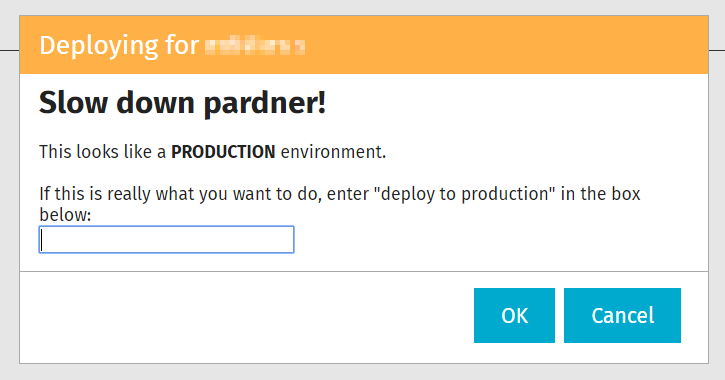
My first fix for this was to make the user type the name of the deployment target that they had just selected. But even this was not enough, because people would blindly type in the name without thinking about it. But, based on a consistent server naming convention, I can tell whether the deployment target is a production server or not. When I detect this happening, I put up yet another dialog in front of the user:

This serves a purpose similar to the glass over the fire alarm: it forces the user to slow down and consider what they are doing. And because this is an internal tool, I get to have a little more fun with the verbiage. :)


